Brushing Up Our Game Post Jam + Lessons Learned
Hi Yall.
It has been one week since we submitted for the Boss Rush Jam, and I thought I should post about some of the lessons we've learned/feedback we've implemented.
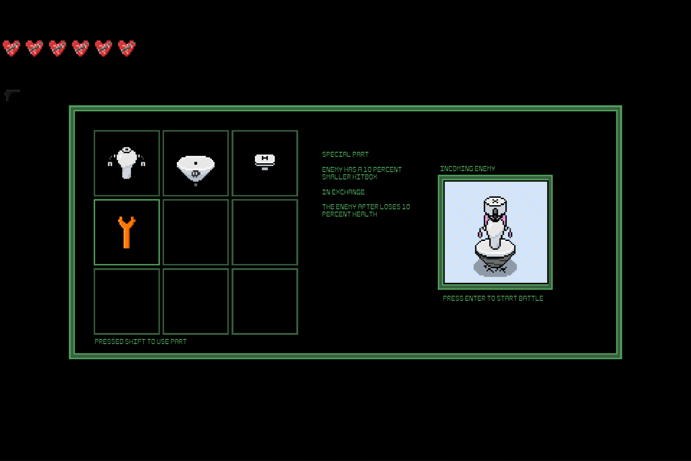
The theme for this jam was Exchange, with the additional rule that our game must be a boss rush. Our idea was to create a roguelike game where the player fights an endless stream of robots made of three body parts(a head, body, and leg), each with unique abilities; During a run, the player can collect body parts that they can exchange with the boss' body parts, allowing players to customize the foes they face in a way that makes the battle easier.

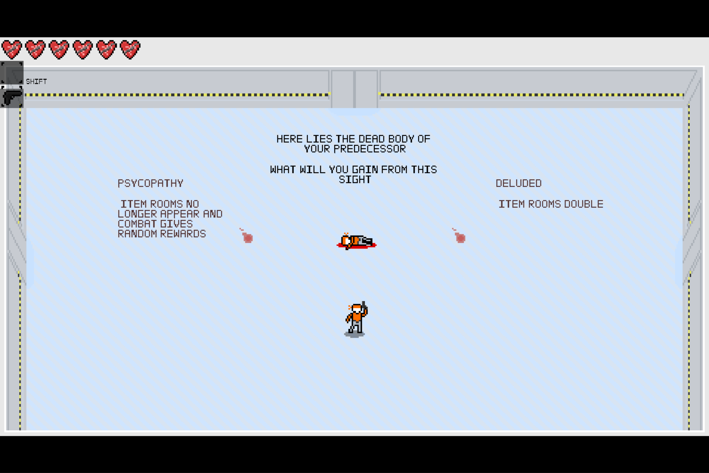
We then fleshed out the game with weapon and item pickups, special parts that apply effects to bosses, special effects the player can pick from after dying, and unique mid and final bosses.

Although the game certainly stretched the definition of a boss rush, it was received very well. And although the results aren't out yet, I'm happy with our performance.
Lessons Learned:
The first thing I felt we could have done better was to finish a demo of our project sooner to get feedback. Despite the Jam having lasted a month, the effect-after-death mechanic and the mid/final bosses were all added in the last 48 hours when testers commented that the game could use more replay value and along with a stronger sense of progression.
If we had gotten a demo out a week earlier and received this feedback, I feel like we could have doubled the number of effects-after-death and fleshed out the final boss a little more.
The second major thing I felt like I've learned was the importance of presentation. To be frank, the actual page of our game was an afterthought amidst everything else going on. The page's color palette, thumbnail, devlogs, screenshots, and description were all made last minute with much less thought put into it than everything else. (And the wall of text explaining the plot probably didn't help either)
All of this resulted in a game page that didn't make a very strong first impression; One of our players told me quite bluntly, "Your game is great, but it looks like something I would have normally scrolled right past."
On that same note, I feel like we could have taken more risks with the art direction of our game. As someone with very little experience drawing, I made the sprites very simple, settling on having them look readable. In my future games, I want to try to make our game art pop a lot more. Even if I'm relatively new to pixel art, I feel like by utilizing techniques like rotoscoping or purposefully emulating old game consoles, I can make my future works much more visually interesting.
TDLR: Even though we were pressed for time, I feel like our game would have benefitted overall if we bumped making a finished demo and crafting the game page up our list while pushing some other things back.
Finally A Quick Run Down of Some Changes We've Made.
- Rebalanced some weapons and special-effects
- Quality of Life improvements for the UI
- Added UI elements that better explain the controls/mechanics
- Brushed up the audio mixing
- Added a sort opening cutscene that explains the story instead of having a wall of text on the game page
I plan to upload these changes once the judging period ends along with a couple more effects-after-death, but aside from that this is the end of a month-long ride.
Get Disassembly Line
Disassembly Line
You are a prisoner. Sent to slow their advance. Your survival is not anticipated.
| Status | In development |
| Authors | divadzeng(The Phlatest Phish), fauxdude, kabringus |
| Genre | Action |
| Tags | 2D |
More posts
- Final BossFeb 05, 2024
- Added cerberusFeb 04, 2024
- Bug fixes and nerfing ng+ buffsFeb 04, 2024
- New Build for Disassembly Line(added SFX , bug fixes, and improved subsequent ru...Feb 04, 2024
- Adding replayabilityFeb 04, 2024
- Disassembly Line ver.0 Submission for the Bossrush JamFeb 03, 2024
Leave a comment
Log in with itch.io to leave a comment.